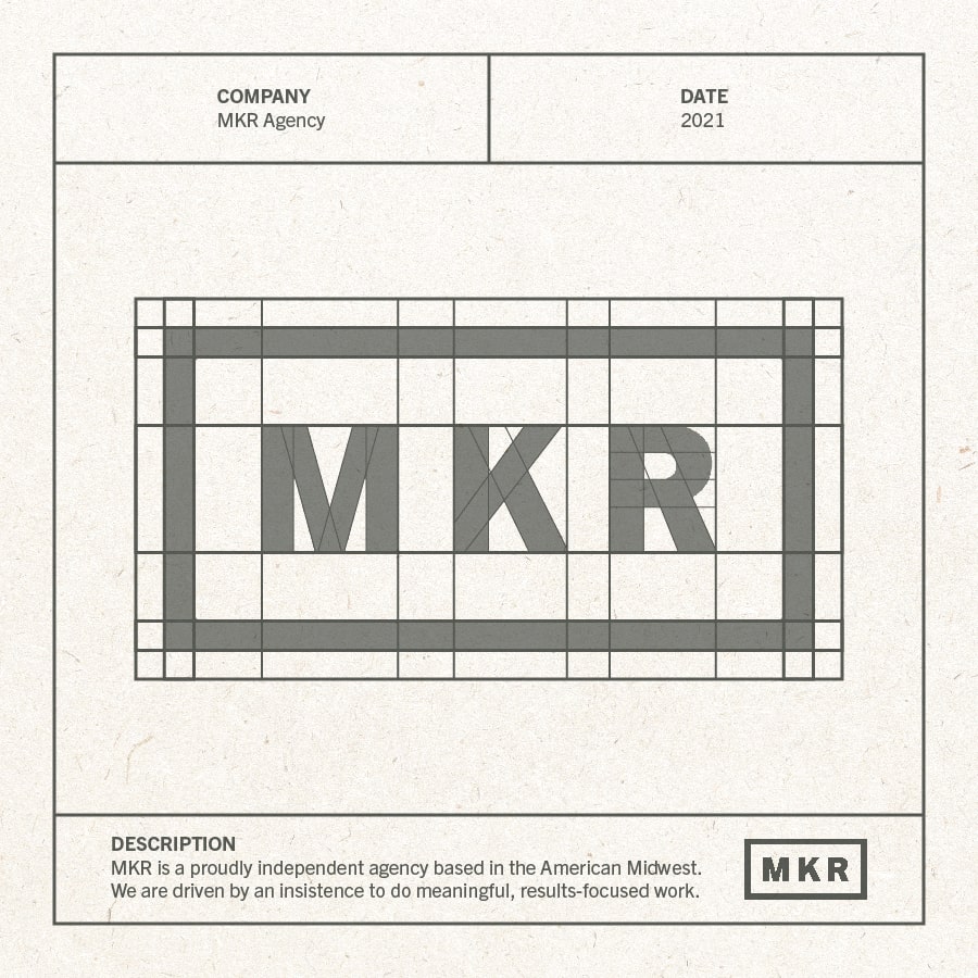
Brand identity may boil down to several factors — colors, imagery, tone of voice — but it’s no secret that a logo makes a brand’s first impression. It’s what catches the eye of the consumer and serves as an instant visual reminder. That’s why creating a logo that represents your brand is essential to success. But what actually goes into the creative process? We asked Senior Art Director Clara Leslie, and here’s what she had to say.
Where to start
Whether it’s on your own or with the client, the logo creation process begins with research. Before any ideas even touch a page, it’s important to look into your client’s field. Research the competitors, see what they’re doing with their brands, and learn from it.
The more research you do, the more inspiration you find and the more unique design you’ll be able to develop on your own.
What you need to know
After you have the initial ideas of what already exists in the logo-filled world, you’ll need to refine your research. You’ll want to form an understanding of each aspect that makes a brand’s identity so influential.
Here are key components you need to consider before putting pen to paper:
- What is the business? (The industry, the direct competition, and the brand identity)
- What are the client’s goals?
- Who is the target audience?
- Who are they trying to reach or gain as potential consumers?
- Is this a redesign or is this a from-scratch creation?
Get the ideas out
The concepting phase is designer-dependent, but Clara shared her insight on what it can look like for some.
“My concepting process would include finding different sources of inspiration. Which is anything from packaging design to digital ads. I collect them and come up with a mood board of sorts to start developing tone,” said Clara.
From there, she dives into sketching and ideating on art boards. For Clara, the process should include breaking down your ideas to the most fine, minute details before you consider even adding the colors or other brand elements in.
Clara continued to say, “I usually design everything in one color, because to me, it should work just as successfully in black and white.”
After you have the backbone of the design, you can start layering in the brand elements, color choices, and begin building out several concepts. Fine tuning about two to three concepts — all of different flair — is the best way to show the client you understand the audience as well as the brand.
Finally, you’ll need to consider the layout. Making sure that your design can exist in vertical and horizontal fashion or live on its own as an icon is a direct indicator of a strong, thoughtful, and successful brand mark.
Advice from the expert
There’s a lot more effort that goes into rendering a brand logo than some might think. Which means it can be difficult to get started. Here are some tips from Clara to help the process go a little smoother for you.
- At the end of the day, a logo is about the audience, not about the client. Always design with that information in mind.
- Remember that feedback is often helpful, but at the end of the day, you are the designer. Your expertise has validity. Be able to back up your choices and be proud of your work.
- Simple doesn’t mean less time-consuming or less effective. Some outstanding logos consist of organic and simplistic elements.
- Keep it timeless. You want your logo to stick around as long as the brand does, so keep in mind that design is ever-changing, but your logo should never seem dated.
- Emotion, emotion, emotion. Color can have a great impact on tone and feeling, but so can typeface, movement, motion, and other graphic elements. Use every element to your advantage.
As a reminder to embrace your expertise, Clara would like to leave you with one of her favorite quotes from Paula Scher, “It took me a few seconds to draw it, but it took me 34 years to learn how to draw it in a few seconds.”
If you’re looking for an imaginative and thorough team of designers to develop your brand’s new logo, we’d love to chat.

